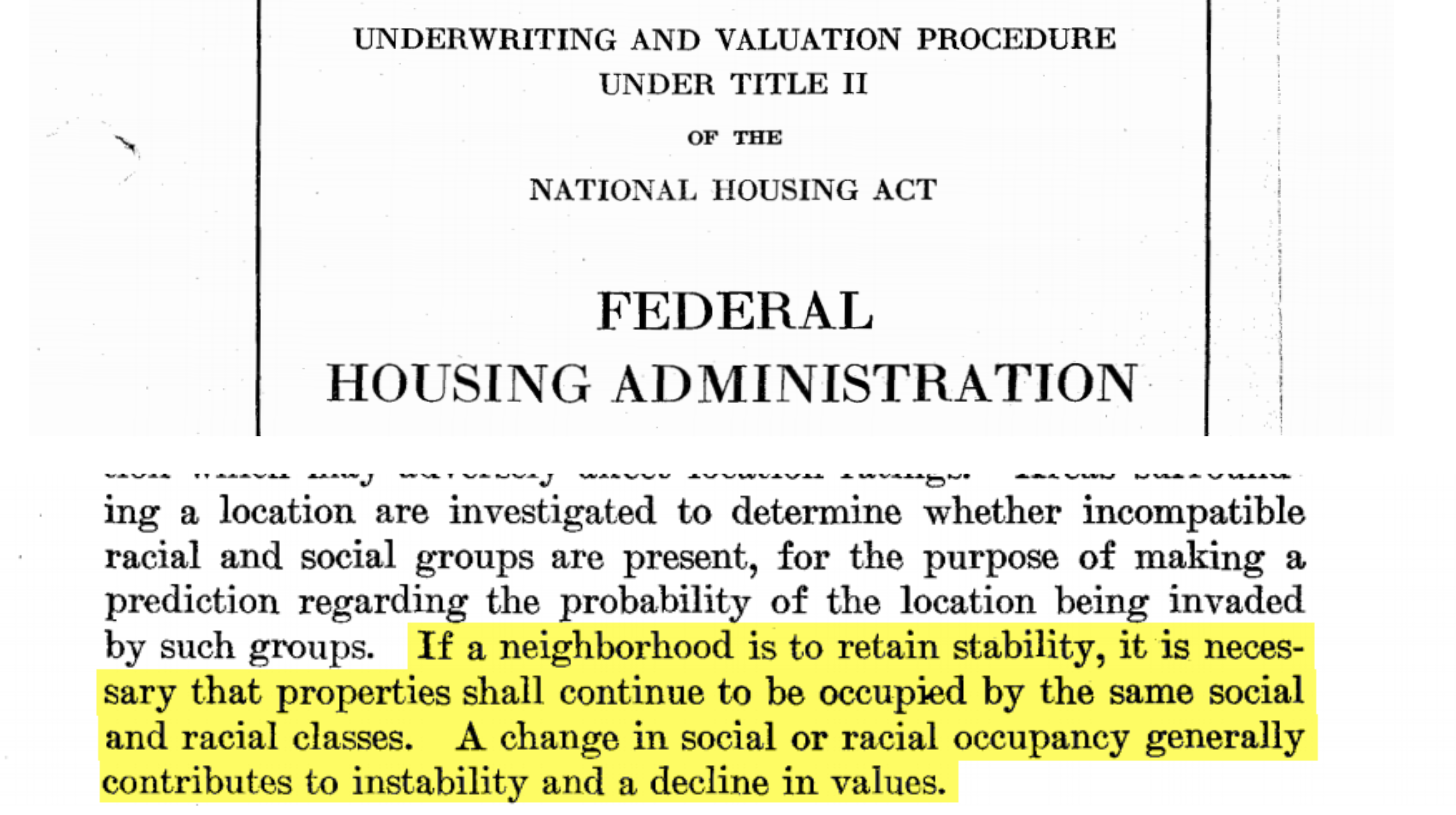
Appraisers gave this grading to neighborhoods where they cited:
... Very undesirable neighborhood of mixed races ... Italian, Danish, Polish, Swedish, Jewish ... Formerly a good residential district with many well built private homes. Now practically entirely negro with many tenements ... Obsolescence and poor maintenance. Infiltration of Negroes ... Colored infiltration a definitely adverse influence on neighborhood desirability ... Low grade Italian population of questionable occupation and income. Very little likelihood of improvement ...
Appraisers gave this grading to neighborhoods where they cited:
... Probably the best area in Staten Island, due to location, homogeneity, and high type of structures ... The major portion of this neighborhood is presently help up by wealthy people, many of whom have large estates overlooking the Hudson. ... A steep bluff separates this area from the yellow and red areas on the east. ... Contains many of the finest and largest private homes. ...
Appraisers gave this grading to neighborhoods where they cited:
... Homogeneous neighborhood of good houses ... A double carfare has protected this neighborhood from any undesirable infiltration ... A small section of desirable homes well protected from encroachment ...
Appraisers gave this grading to neighborhoods where they cited:
... One hour from Times Square by subway, car and bus. Infiltration of lower grade population ... This is rather a mediocre neighborhood with only limited prospects of improvements ... There has been a small settlement of negroes on 99th St. for many years, apparently not spreading. The district may gradually improve ... Mostly developed 30-40 years ago with fairly good grade apartment houses, it has been steadily deteriorating due partly to influx of negroes ...
Studying this map shows us where housing discrimination was strongest in late-1930’s New York. I connected these grades with longitudinal census data from 1940-2010, tracking changes in racial composition and real estate markets to better understand where its damaging effects are still felt. I then picked out specific neighborhoods with similar population demographics or homeownership markets in 1940, connected these communities to the gradings they received at that time, and followed their housing markets through 2010. These case studies offer a first glimpse into where and how racial discrimination may have contributed to imbalanced opportunities to build wealth in housing.
You can look through each of these case studies below, or explore the map on your own to see if you can unearth potential threads of housing discrimination yourself.
Homeownership rates in Harlem lag behind the Upper East Side
Homeownership has consistently grown in greenlined Upper East Side while staying stagnant in redlined, majority non‑white Harlem
Case Study: Manhattan
Upper East Side / Harlem
Pct Non‑White
Pct Homeownership
Median Home Value (2010 Dollars)
Housing markets are dramatically different in Harlem and the Upper East Side, close neighbors in Upper Manhattan. In the 1940's, over 95% of residents in both neighborhoods lived as tenants. Homeownership has consistently climbed in greenlined Upper East Side in the decades since, now one of the most lucrative real estate markets in the world. In redlined Harlem, often considered the cultural center of black America and one of the only majority non‑white neighborhoods in 1940's New York, homeownership has stayed low. Homeownership in this area of the Upper East Side is now more than four times greater than in Harlem.
A brownstone at 132 East 80th St. currently worth $9.9M
A brownstone at 102 West 121st St. currently worth $2.6M
In residential Queens, Little Neck property values outpace Brookville
The average house in Little Neck is now worth almost twice as much as in Brookville
Case Study: Queens
Little Neck / Brookville
Pct Non‑White
Pct Homeownership
Median Home Value (2010 Dollars)
Little Neck and Brookville, two residential neighborhoods in eastern Queens, may show the damaging effects of housing discrimination on property values. Housing prices in these two neighborhoods were a bit closer together before their racial demographics changed – in 1960, both areas were overwhelmingly white and only $60k separated their average homes (in 2010 dollars). In the decades since, housing prices in now majority-minority Brookville haven't caught up with increases in Little Neck, where the median house is now worth almost $400k more.
A house at 6 Beverly Rd. currently worth $2.1M
A house at 142-25 230th Pl. currently worth $476K
In Todt Hill, real estate markets outgrow New Brighton
Todt Hill is one of Staten Island's most exclusive and expensive neighborhoods, with homeownership rates and property values doubling those in nearby redlined areas
Case Study: Staten Island
Todt Hill / New Brighton
Pct Non‑White
Pct Homeownership
Median Home Value (2010 Dollars)
In the 1940's, greenlined Todt Hill and a redlined area spanning New Brighton, Tompkinsville, and Stapleton were both predominantly white with almost identical property values. The racial demographics of these neighborhoods now look different, as majority white Todt Hill is now neighbored by more multi-racial communities to its northeast. Todt Hill has one of the more exclusive and expensive real estate markets in Staten Island, with homeownership rates and property values more than double those of the redlined neighborhoods highlighted.
A house at 653 Todt Hill Rd. currently worth $1.6M
A house at 16 Cedar St. currently worth $340K
In Brighton Beach, housing markets stay consistent with Crown Heights
Homeownership rates and property values for Brighton Beach's large immigrant population haven't outpaced markets in many majority non‑white areas
Case Study: Brooklyn
Brighton Beach / Crown Heights
Pct Non‑White
Pct Homeownership
Median Home Value (2010 Dollars)
Brighton Beach has stayed majority white since the 1940's, but its property values and homeownership rates haven't outpaced many majority-minority neighborhoods. There is a large immigrant and foreign-born white population in Brighton Beach, especially Russians and Jews, who were also subject to discrimination but are included alongside native-born whites in a white/non‑white distinction. The homeownership market in Brighton Beach has remained remarkably consistent with that in Crown Heights, where white flight and migration from the American South and the Caribbean contributed to the neighborhood's rapidly changing population demographics in the 1960's.
A two-family unit at 126 Neptune Ave. currently worth $608K
A townhouse at 1312 Union St. currently worth $1.2M
In Fordham, the housing market hasn't caught up with lower-graded Country Club
Though it received a worse redlining grade, markets in Country Club have outpaced those in now majority-minority Fordham
Case Study: The Bronx
Country Club / Fordham
Pct Non‑White
Pct Homeownership
Median Home Value (2010 Dollars)
Even in neighborhoods receiving more favorable redlining grades, the emerging presence of non‑white residents was often met with suppressed property values and restricted access to mortgages. Fordham and Country Club are two neighborhoods in the Bronx that were almost exclusively white in the mid-1900's. Country Club is a more owner-centric market, while Fordham has a much higher proportion of renters. Property values in Fordham, which saw an influx of non‑white residents from 1970 to 1990, are almost $200k lower than in Country Club.
A house at 3135 Country Club Rd. currently worth $645K
A three-family unit at 2596 Briggs Ave. currently worth $631K
A complex, ever-changing market landscape
Countless factors influence homeownership and property values, especially in a complex and ever-changing New York market. By connecting official government redlining maps from the late-1930's with changes in housing markets since, we can start exploring where discriminatory practices have left a lasting impact on New York City housing opportunities.
Explore the map on your own to see if you can unearth potential threads of housing discrimination yourself.
Pct Non‑White
Pct Homeownership
Median Home Value (2010 Dollars)
About the data and methods:
This project was completed by Ryan Best as part of a graduate thesis for the Masters of Science in Data Visualization at the Parsons School of Design in New York, NY.
My thesis advisors were Aaron Hill, Daniel Sauter, Christian Swinehart, and Richard The.
Redlining zone boundaries, gradings, and area descriptions (including apprasier quotes) are from the Mapping Inequality project. Data was downloaded in GeoJSON format for Manhttan, Brooklyn, Queens, the Bronx, Staten Island, and lower Westchester county.
Census data and tract boundaries for each decennial census from 1940 to 2010 are from the IPUMS NGHIS database. Included in census data by tract were tabular data tables used to estimate percent non‑white, percent homeownership, and median home value.
Census data by tract were joined to redlining zones using geospatial geometric analysis made possible with the Shapely Python library. Census data estimates were weighted by the proportional size of a tract's geographic area of intersection with a redlining zone. Data was averaged across multiple redlining zones for neighboorhoods in case studies.
1939-1941 building images are from the online gallery of the New York City Municipal Archives' Tax Photograph Collection. 2019 building images are from the Google Maps Street View Static API
Geographic boundaries of New York City boroughs are from dwillis' nyc-maps GitHub repository
Scrollytelling made possible with Scrollama.
Building image comparisons made possible with JuxtaposeJS.